Apologies if this post shows up twice for anyone using feed readers. Windows Live Writer screwed things up a bit…
With today’s cars having more and more functionality – stereos, built-in navigation, the engine computer metrics etc. – the steering wheels start to have more and more buttons. Sometimes it’s on the wheel itself, sometimes it’s on separate “whiskers” behind it, similar to turn signals and others.
However, many cars just get the controls for all that very very wrong, so I thought it would be fun to do a small usability study.
The study target
Since I haven’t driven many very new cars with computers and all that built in, let’s just look at the steering wheel of the 2006 Honda Civic – one of which I coincidentally happen own. If your car has similar features as the Civic, please write your opinion about its usability in the comments!
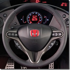
Here’s a photo of the wheel. Explanations for the buttons on the wheel are, from left to right on the left:
- Next/previous CD track or radio channel
- Volume up/down
- Change between player modes (FM radio, CD, etc.)
On the right:
- Cruise control system main switch (system on/off toggle)
- Cruise control speed control, enable cruise at current speed, enable cruise at previous cruise speed
- Cancel cruise control
Buttons on the bottom left are something about bluetooth phone control. I don’t have those on mine.
The ones on bottom right are for changing what the display inside the dash shows etc.
The problems of this design
The main issues of this design are on the buttons that are at the center line of the wheel.
Starting from left…
- I occasionally confuse the track changing buttons and volume control buttons because they are next to each other and work pretty much the same.
- The cruise control system main switch is useless: The button simply disables the whole cruise system, making it not possible to use the other cruise buttons. Pressing it again enables the system. I can’t think of any reason why the button is necessary to have on the wheel – The cancel cruise button goes back into manual speed if you were in cruise.
- The cruise speed buttons do two things depending on whether you are already in cruise or not
- The cruise control speed buttons change speed in increments of 1.3 kilometers
How would I improve this?
There are some quite simple changes to this that would make the problems pretty much disappear. Why didn’t Honda think of them if they are so simple? No idea.
Problem #1: If you have two buttons that do something similar, such as in this case, make the other button different. The volume up/down buttons could simply be a small knob.
If the volume control on the wheel was a small knob, there would be no problems. You can easily remember that the knob controls the volume and the buttons control the track – in fact, it’s actually almost intuitive, not to mention that using a knob to control volume feels much more natural than buttons.
Problem #2: Remove the cruise system main switch. Could be replaced by something more useful. Alternatively, the cancel button could be replaced by this button.
Problem #3: This one is a bit trickier. You would either have to add more buttons or make some other button do some of these two’s jobs. For example, the cancel button could be made “Cancel cruise / set cruise at current speed” because canceling cruise or setting cruise are actions that exclude each other.
An example of an action that excludes some other action can be seen in web browsers: In most browsers, when you go to an address, the reload button becomes “stop”. Reloading a page and stopping page loading are actions that don’t make any sense to be performed at the same point, so the other action excludes the other one.
However, the issue isn’t really so big. Unlike on the left side, on the right there’s only one button that can be pressed up and down, so after a while it’s quite easy to remember what the button does depending on whether you are in cruise or not.
Problem #4: This is the weirdest thing of it all. Why does it have to be 1.3 kilometer increments? The car already has a digital speedometer which tracks speed at, yes, precision of 1 kilometer – not 1.3, 1.6, but exactly 1 km. Now the amount of mental math I need to do when I want to change the speed by a specific amount is much higher than if the amount was 1 km, and there should be no technical limitations preventing them from using exactly 1 either.
In closing
Despite these minor issues, I think the Honda steering wheel is designed quite well. I’ve driven some other cars with similar functionality, but most of them were much more difficult to access because they had not thought about putting them on the wheel, or the layout of the buttons was poor and difficult to remember the exact functions.
For example, I drove a Seat Ibiza with cruise control etc., but I could never remember how the system was operated because the controls were just so poorly designed.
Do you have a car? What are your thoughts?
